
A dashboard is not a pile of charts
The measure of a good dashboard isn’t how many charts it holds but how many seconds it takes the viewer to make a decision. So we start from questions, not charts: which three questions does the person looking at this screen want answered? The dashboard is built around those three; everything else moves to a second level.
The second principle is separation by role. The field team, the manager and finance don’t need the same screen; the same data produces different views so each can make their own decision.
We take the data from wherever it lives
| Data source | What’s required | Time |
|---|---|---|
| Your existing database | Read-only access | 1-2 weeks |
| Third-party system with an API | API key and permissions | 1-3 weeks |
| Excel / CSV files | A consistent file format or an upload screen | 1-2 weeks |
| System without an API | An export flow or an integration layer | 3-5 weeks |
| Several sources combined | A shared identity field (customer, order no, etc.) | 4-8 weeks |
Report automation
Automated reporting usually sits alongside the dashboard: a one-page summary emailed to the manager every Monday morning, a monthly PDF management report, or an instant alert when a threshold is crossed. That removes the "forgot to check the dashboard" problem, since the report goes to the user instead.
How data gets from the source to the screen
The shared data layer is where records from different systems are brought into one consistent shape. In most setups the dashboard reads from this layer and leaves your accounting software or shop platform alone. Your source systems stay fast, and adding a new source later doesn’t mean rebuilding the dashboard.
Refresh rate: live, hourly or overnight?
This is the decision most often skipped when scoping. Not every dashboard needs to be live, and the more often the data refreshes, the more it costs to build and to run.
Live
For work that needs a response within minutes: field operations, courier tracking, stock alerts. The source system has to be able to hand this data out.
Hourly
Enough for most sales and order screens that get checked a few times a day.
Overnight
For management reports, monthly comparisons and finance views. The cheapest option, with the fewest moving parts.
How the PulseIQ demo lays out a screen
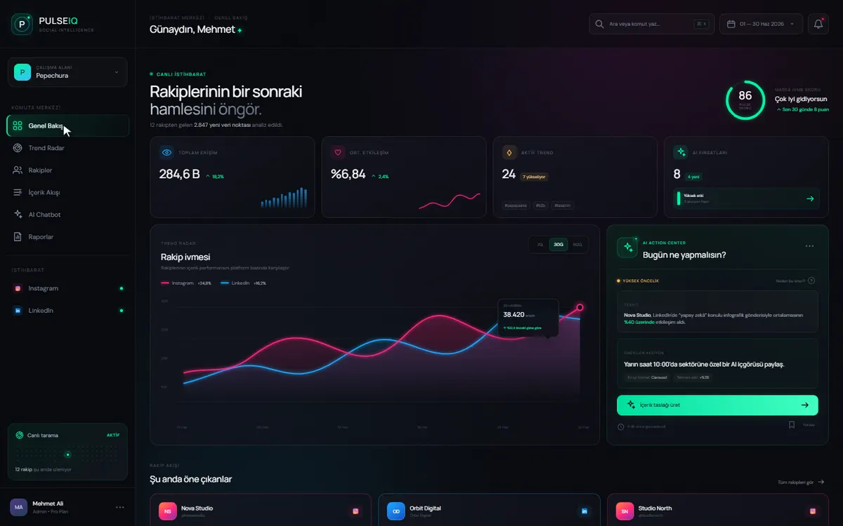
This demo was built for tracking competitors on social media, but the layout suits most dashboards. Four numbers sit at the top, so the viewer knows within seconds whether things are going well. One main chart in the middle shows the trend. The panel on the right answers “what should you do today?”, and the action button is on the same screen.
What to prepare before we start
- Who will use the dashboard, and which decision each of them makes in a typical week
- The last few copies of the report someone currently builds by hand (an Excel file, an email or a PDF)
- Access details for each data source, or the name of the person responsible for that system
- Written definitions of your key metrics: is revenue before or after VAT, are refunds deducted, how many days without activity before a customer stops counting as active
- How far back comparisons need to go (the last 12 months, the last 3 years)
Frequently asked questions
Our data is scattered. Can you still build a dashboard?
Yes, and this is the situation we meet most often. Bringing data from different systems and files into one dashboard is a normal part of the work. What matters is that a shared identity field exists across sources, such as a number or code that lets us match the same customer in two systems. If none exists, defining one is the first job.
How long does a data dashboard take?
A dashboard fed by a single existing database is ready in 1-2 weeks; one fed by third-party systems with APIs takes 1-3 weeks. Combining several sources pushes this to 4-8 weeks, most of which is cleaning and matching the data.
Why a custom dashboard instead of an off-the-shelf BI tool?
Ready-made tools are good for standard reporting. A custom dashboard is the better fit when the data needs interpreting through your own business logic, when the dashboard must be embedded inside a process (seeing and acting on the same screen), or when per-seat licensing cost becomes unpredictable.
Where is the data stored?
On your own server or in a cloud account opened in your name, as you prefer. Where read-only access is enough we can work without touching your existing system at all. In every case the data belongs to you.
Will the dashboard slow down our existing systems?
Usually not. We pull data from the source system at set intervals and keep it in a separate layer, so heavy queries run against that copy. Where live data is needed, we agree together on a refresh rate the source system can handle.
What drives the cost of a dashboard project?
The number of sources and how much cleaning the data needs matter far more than the number of charts. Projects start from US$1,000, and our rates are US$25-60 per person-hour, depending on the role. Once we have seen your sources and the questions to be answered, we quote a fixed price for the scope or work on time & materials.
Will we depend on you to add a new chart later?
No. The full source code and IP pass to you on final payment, and delivery includes documentation and setup instructions, so your own team can add new views. If you’d rather keep working with us, a monthly retainer covers that.