Why prototype first
A product is hard to describe and easy to show. With a clickable prototype, founder, team and client look at the same screen and picture the same thing before any code exists. At this stage a change costs minutes; the same change after development starts costs days.
The site you are browsing and the live demos on our projects page are this approach in practice: instead of explaining the product vision, we show it working.
Delivery types
| Delivery | What it includes | Time |
|---|---|---|
| Flows and wireframes | User flows, low-detail screens | 3-5 days |
| Interactive prototype | Clickable, with realistic sample content | 1-2 weeks |
| Design system | Colour, typography, component library, theming | 1-2 weeks |
| Full screen set | Every screen and state, ready for development | 2-4 weeks |
| Refresh of an existing product | Interface revision, flow simplification | 2-4 weeks |
You can take design only
Taking the design from us and building it with your own team is entirely possible. In that case delivery includes design files plus component behaviour, states (empty, loading, error) and responsive rules, so a developer can implement it without asking questions. The reverse also holds: if you already have designs, we can take on development alone.
A product is hard to describe and easy to show. A prototype closes that gap.
Four questions that set the visual language
When choosing a visual language, the first thing we look at is who reads the screen, where, and for how long. Brand colours are then fitted into that decision.
Who uses it?
An office worker at ease with software, or a shopkeeper who mostly uses their phone for WhatsApp? Text size and wording change with the answer.
Where?
A bright shop, a dim warehouse, a building site in full sun. Contrast and theme follow the light where the screen is used.
For how long?
An operations screen left open all day and a settings page visited once a month aren’t designed with the same density.
On which device?
Desktop, tablet, phone or a touchscreen kiosk. Touch targets and menu structure are decided together with the device.
Two demos, two visual languages: EsnafDefter and ServisPro
EsnafDefter: for someone coming from a paper ledger
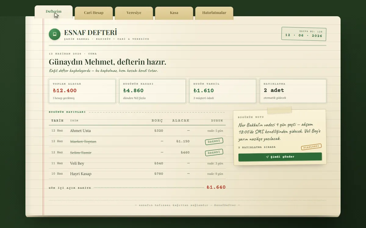
A grocer or a mechanic has often kept a paper ledger for years. So the demo opens on cream paper with ledger tabs, ruled lines and a handwritten note. The debit and credit columns sit in the same order as in the book. The user finds an old habit on screen without feeling they are learning new software.
ServisPro: for a screen left on all day in the workshop
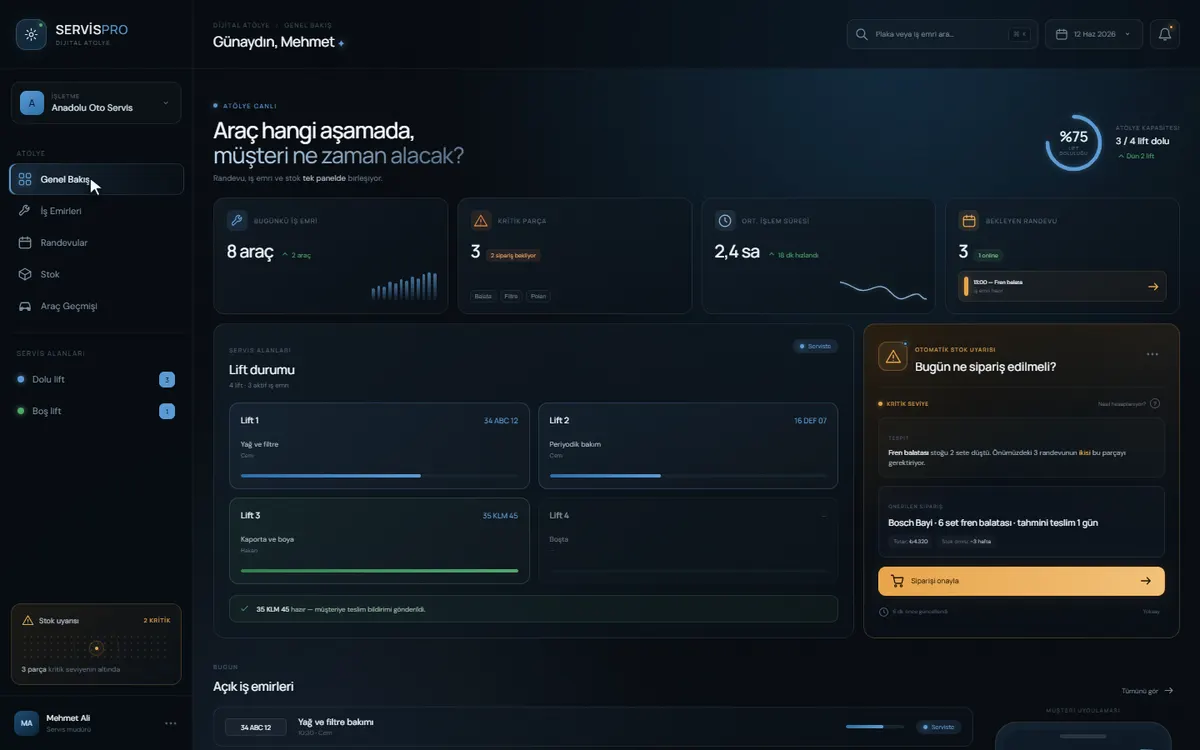
In a garage the screen stays on all day at the counter or on a wall, and it is often read from a few metres away. A dark background, large numbers and one card per lift show the state of the workshop at a glance. The critical parts alert, the one thing that needs action, stands out in orange.
Test the prototype with a few real users yourself
The real value of a clickable prototype is that real users can try it before any code exists. You don’t need a lab: short sessions with 5-6 people usually bring the biggest problems to the surface.
- 01
Write a task
Don’t explain the screen. Give them a real job, such as “cancel the order you placed last week”.
- 02
Leave the user alone
Don’t help when they get stuck. Ask them to think aloud, and just listen.
- 03
Note where they stall
Where did they stop, what were they looking for, which button did they misread? When a second person stalls in the same place, you have found a design problem.
- 04
Fix it and try again
Changes are quick at prototype stage. Make the fix and test it with the next person.
Questions to ask when you get a design quote
- Is the prototype clickable, or will you get static screenshots?
- Are empty, loading and error states included in the quote?
- Are the component library and the colour and typography rules delivered as a design system of their own?
- If you need a dark theme, is it planned from the start?
- Are accessibility checks, such as contrast and touch-target size, part of the work?
- Who owns the design files and the IP when the project ends?
Frequently asked questions
Can I hire you for design only?
Yes. We work end to end, but we also take design-only engagements. In that case we deliver a set your development team can implement directly: screens, component behaviour, empty/loading/error states and responsive rules.
How long does the design phase take?
Flows and wireframes take 3-5 days, a clickable prototype 1-2 weeks, and a development-ready full screen set 2-4 weeks. Within an end-to-end project the design phase is typically 2-4 days, because scope has already been narrowed during discovery.
How many revisions do I get?
We don’t cap revisions by number; we work in stages instead. We don’t move to visual design before the flow is approved, or to the full screen set before the visual design is approved. That prevents large reversals and keeps the process predictable.
Can you work with our existing brand identity?
Yes. If you have brand guidelines the design is built on them; if not, we create a consistent system of colour, typography and components for the product. That system then serves as the reference for any screens added later.
Who owns the design files?
The design files and all the IP pass to you on final payment. The design system is part of the delivery, so even if you later work with another team, new screens can follow the same rules.
Does every product need a dark theme?
No. It helps on operations screens left open all day and in dim settings; on an admin screen opened a few times a month it is usually unnecessary. If you will need it, planning it from the start is less work than adding it later.
What do you check for accessibility?
Our basic checks are the contrast between text and background, readable text sizes, touch targets that are easy to hit with a finger, and alerts that don’t rely on colour alone. A colour-blind user should still notice a red alert thanks to the icon or text next to it.